Inspiration || User Interface Animations
I had so much fun looking for these inspirational examples of user interface animations. There are so many unique, fun ones out there and people can get super creative! It's amazing to see how much these small, slight animations add to the interface and the user's experience as a whole. I found each of these at https://1stwebdesigner.com/ui-mobile-app-animations/
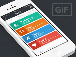
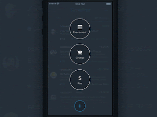
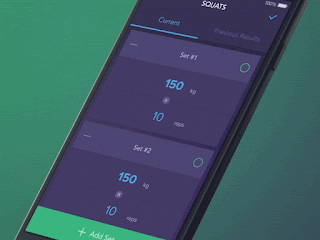
1. I loved the process of color coating the different categories for this persons accounts / credit cards. It makes it fun and interactive while also differentiating the categories easily.
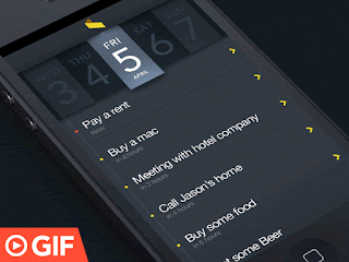
2. I love checking things off of my to do list and I thought this app was a really creative way of making the user feel accomplished by deleting their tasks. There's something so satisfying about seeing your "to do's" slowly disappear. It is also a fun way of assigning a task to a specific person.
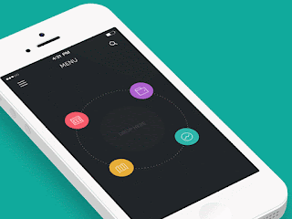
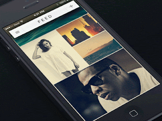
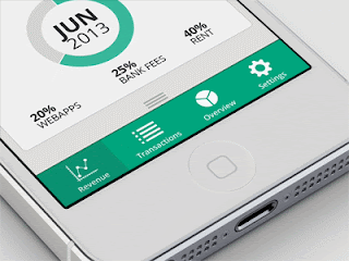
3. I love the idea of seeing your menu options and then dragging what information you are seeing to the center to access it. Then the color associated with that information fills the screen making it easy to know where the user is in the app.
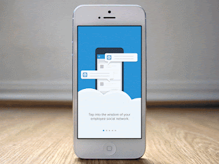
4. This is an example of a walk through / tutorial of how to use an app, but each of its movements are really clear, simple and flows really nicely from one to another.
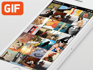
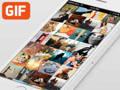
5. I love this idea of being able to easily categorize photos however you'd like! I have 5,000+ pictures and videos on my camera roll and it drives me absolutely insane when I can't find that one I'm looking for...Yes there is the folder option but this app has a different effect. It reminds me of pinning things on Pinterest.
6. The small, simple movements of each click or letter / number typed add a nice clean feeling to every tap.
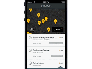
7. I have a parking app that is very similar to this where it shows all of the nearest, cheapest places to park in your location but the movements of this app and how they change based on your location or position are very fun.
8. I really like the dropping down of the menu on this app and how the numbers roll until they get to where they need to be. The slow appearance of the other information is subtle but effective.
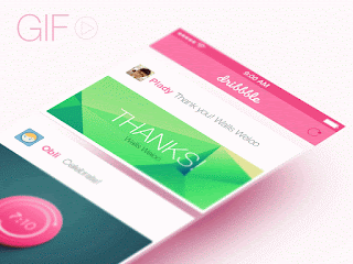
9. This is such a fun and clever way to do a refresh! The top nav bar changes from a rectangle into a rounded almost "half court" looking shape when it's pulled and it is done really nicely! Very cute!
10. I really liked the way that when the little circle is checked off on this app that the box is filled with color. Very unique!
11. This is such a small and subtle movement of the navigation menu but I think it works really well. It adds more space for other content but lets them know they can still access that information if needed by the mini hamburger menu.
1. I loved the process of color coating the different categories for this persons accounts / credit cards. It makes it fun and interactive while also differentiating the categories easily.

2. I love checking things off of my to do list and I thought this app was a really creative way of making the user feel accomplished by deleting their tasks. There's something so satisfying about seeing your "to do's" slowly disappear. It is also a fun way of assigning a task to a specific person.

3. I love the idea of seeing your menu options and then dragging what information you are seeing to the center to access it. Then the color associated with that information fills the screen making it easy to know where the user is in the app.

4. This is an example of a walk through / tutorial of how to use an app, but each of its movements are really clear, simple and flows really nicely from one to another.

5. I love this idea of being able to easily categorize photos however you'd like! I have 5,000+ pictures and videos on my camera roll and it drives me absolutely insane when I can't find that one I'm looking for...Yes there is the folder option but this app has a different effect. It reminds me of pinning things on Pinterest.
6. The small, simple movements of each click or letter / number typed add a nice clean feeling to every tap.

7. I have a parking app that is very similar to this where it shows all of the nearest, cheapest places to park in your location but the movements of this app and how they change based on your location or position are very fun.

8. I really like the dropping down of the menu on this app and how the numbers roll until they get to where they need to be. The slow appearance of the other information is subtle but effective.

9. This is such a fun and clever way to do a refresh! The top nav bar changes from a rectangle into a rounded almost "half court" looking shape when it's pulled and it is done really nicely! Very cute!

10. I really liked the way that when the little circle is checked off on this app that the box is filled with color. Very unique!

11. This is such a small and subtle movement of the navigation menu but I think it works really well. It adds more space for other content but lets them know they can still access that information if needed by the mini hamburger menu.


Comments
Post a Comment